
Today’s guest post is by Steve Grooms
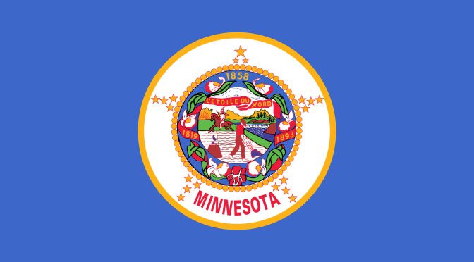
It seems some southerners just can’t let go of the Stars and Bars, the Confederate battle flag. They consider it a symbol of a romantic past. Historians tell us it is a romantic past that never existed, but romantics do not let facts get in the way of convictions. And yet, who are we to feel smug about anyone else’s flag? The Minnesota flag is hardly an example of beauty and positive values. There is actually a scholarly group that studies flags and critiques their design. The American Vexillological Association rates the Minnesota flag as sixth in the country—and that is sixth from the bottom, not the top!
When it comes to rankings, Minnesota almost always ranks best or close to best. But it is an official and undeniable truth: our flag sucks. Our flag ranks somewhere like political ethics in New Jersey, environmental protection in Louisiana, or public schools in West Virginia.
Ouch!
More to the point, our flag is highly offensive to Minnesotans whose ancestors were here before Europeans arrived to “discover” the Mississippi River (right where it had always been), chop down the white pines and extirpate such critters as elk, wolves and buffalo.
The flag depicts a European settler tilling his field. His holds a plow, although his rifle is nearby. He looks over his shoulder at a near-naked Indian on horseback who carries a spear. This odd scene is Minnesota? Well, it was when the flag was adopted in 1893, just 21 years after the tragic conflict between the Dakota and the state’s pioneer settlers.
According to a historian quoted in a recent Star Tribune story:
“The image of the pioneer, a peaceful man who has laid down his gun and is plowing his field, is juxtaposed with the image of the Indian, who may still want to fight (his spear is at the ready) but who seems to be riding away.
“The pioneer/farmer is using a plow, a symbol of civilization. The white man is depicted as a ‘doer’ who is entitled to the land, trees and water, empowered by the concept of Manifest Destiny. The Indian is the vacating tenant. A peaceful transition is suggested, but this ignores the tense and problematic history of conflict between European settlers and Indians, such as the complicated history of treaties and the Dakota War of 1862.”
I have other quibbles with the flag:
The logo declares, “L’ Etoile du Nord.” French, of course, is the native language of Minnesota.
The Indian is seen as riding south (which we know because of the position of the setting sun). And yet we know that Sioux survivors of the Dakota conflict were forcibly relocated to a bleak bit of land in central South Dakota. They didn’t ride there but were shipped out on boats like prisoners of war.
The river shown in the flag is widely presumed to be the Mississippi. Oddly, it runs west to east.
The pioneer is shown pushing his plow by hand. We could ask our farmer friend, Ben, how well that would work. I believe we are meant to be inspired by the stump in the field because it represents something like civilization. I am more inclined to see a stump as a symbol of the pioneers’ heedless abuse of nature.
The seal celebrates the beauty of Minnesota’s mountains. Somehow, like the little town of Lake Wobegon, the famous Minnesota Mountain Range fails to appear on modern maps.
The flag celebrates farming and logging, the most important industries of 1893. But gee, there are so many important businesses now that the flag fails to recognize. Shouldn’t the state flag have a Cheerio on it to acknowledge our food companies? Why is there no pacemaker on the flag? No Post-it Notes? No brewery? Shouldn’t our flag include the logo of Minnesota Vikings, or at least the Twins?
How about those flowers circling the plowing scene? They do nothing for the overall design, which is as cluttered as a teenager’s bedroom. Flags should look good from a distance, even when flapping in a wind. Our flag looks like something designed by a committee, a committee of folks who flunked the only art class they ever took.
What we have is a flag that is politically offensive and factually goofy. I could live with that if it were pretty. But, alas, our state’s flag is vexillogically challenged. What we somehow inherited is a flag that flag experts consider “a really, really, really crappy design.”
If it were yours to design, what would Minnesota’s flag look like?

Interesting! Reminds me of a Ted talk about the design of flags. Even if you discount the message of our flag, according to this guy, just the design elements stink:
I’d like something with either bear/deer on it or maybe a stylized loon or ladyslipper? Gotta have blue for the lakes. And white for the snow!
LikeLiked by 1 person
What a great find, vs! And it perfectly sets up the idea of this blog. Good of you to remember it.
LikeLike
Lots of good lessons in this about design of any sort.
LikeLiked by 1 person
Good morning. Three strips, blue on the top, white in the middle and green on the bottom with a loon in the center of the white strip.
LikeLiked by 5 people
Nice!
LikeLike
I like it, Jim!
LikeLike
Rather like CA’s classic bear, which may be the best flag.
LikeLike
Simple and classy.
LikeLike
RISE AND DESIGN BABOONS!
Could we have a TB flag with a baboon? Now that would be fun.
But back to MN. I will mull this all day, of course. MN really is three different states:
1. Up Nort–woods, lakes, hunting, fishing, iron ore, L. Superior, shipping
2. Prairies and Plains, i.e. N. Iowa and East Dakota with lakes, cabin, fishing and agribusiness from farmin’ to food services.
3. Metro/Citified cultures of urban areas, medical services, fine universities, and all kinds of art.
Somehow, someway, a flag needs to reflect that in simply, symbolic images. We did it with the state quarter. So how about a flag.
I am with Jim–a loon would be a great start. I heard one here the other day.
LikeLike
It is so funny about loons. The people who add background ambient sound effects to movies are called Foley artists. The add sounds like dogs barking and birds calling, and without their efforts movies would sound oddly sterile. Foley folks are absolutely infatuated with loon calls. Although loon calls are mostly heard on a few lakes in Minnesota, Wisconsin and Michigan, few Foley artists have the will power to resist limiting them that way. You will hear loons calling in the background of almost any sort of film, especially mysteries.
LikeLiked by 3 people
Now we are going to be listening for them.
I’m pretty sure there were loons in On Golden Pond, in fact, I think Katharine Hepburn talks about them….
I don’t think they were in our version of up Nort’
LikeLiked by 1 person
Steve, great topic. I love the challenge of design. Another road not taken.
LikeLike
Makes you wonder what the other 5 worse ones are like…
I see four quadrants: a lake with a cabin and a loon, a half-prairie half-farm with a sack of flour pictured (I liked the Cheerio, Steve, but it won’t show up as well), some woods with the lady slipper and a deer, and a cityscape with… not sure how to get taconite and medical industries in there. I’m beginning to see the problem flag designers have.
LikeLike
OMG, I forgot the Mosquito.
LikeLiked by 4 people
Solid green
LikeLiked by 2 people
That takes care of the clutter, Clyde!
LikeLiked by 1 person
Only partly a jest. I would design a flag with very little beyond colors. No words. No humans. It would suggest three bands of color. Blue on top, gold in the middle, green on the bottom. Near the top of the blue band one large white star with five smaller stars scattered below it.
LikeLiked by 1 person
Do the starts have any special meaning, Clyde?
LikeLike
L’toile du Nord.” One star is weak design. White would be weak. More silver. Some of the stars falling into the gold field. It would offend Alaska, with their Big Dipper.
LikeLiked by 1 person
Nice post, prose perfection.
LikeLike
It is also a very expensive flag.
Lots of schools have struggled with the imagery for a long time, and the expense. I had a history who in 1958 would point out the imagery as tasteless. We did not know to say racist then.
Two Harbors old high school had WPA murals at the front of the auditorium which were not very good an showed native peoples in demeaning status. Lots of things about that building I was glad to see gone, but those murals first. I used to have AP English students decode those murals and the flag.
LikeLike
Love Jim’s design. I’m in favor of something that doesn’t have anything to do with the industries (which are constantly changing), but highlights the natural beauty of this most wonderful place- which we hope endures.
LikeLiked by 2 people
MIG, you could KNIT a flag!
LikeLiked by 2 people
Horrors! The thought sends shivers down my spine. It’s bad enough as it is.
LikeLike
A knit flag with Charlie Brown on one side and Snoopy on the other. Under Charlie “ja, sure.” Under Snoopy, “you betcha.”
LikeLiked by 1 person
There you go!
LikeLike
I could, but a) there are so many knitting traditions in this state I would have to honor and b) not all our cultures have a knitting tradition.
I do think it would be cool to make a sampler quilt that would honor the textile traditions of all our people….
Yet another project I can clearly visualize and can only hope I will someday be able to make.
It would, of course, also make an excellent collaborative project, but I leave that to someone who is an organizer-not. my. skill.
LikeLike
I hate including the industries just because I wish government didn’t . . . um . . . kiss up to economic interests as often as it does. Government already tries too hard to please its most powerful economic groups.
LikeLiked by 2 people
Several years ago the Strib, before it was the Strib, ran a contest, no prizes, for a new state motto. Some were very funny. My preference of the joke ones, and they published mostly joke ones, was le toilet du nord.
If we redo the flag, I suppose we do the motto. But I rather like l’toile du nord.
LikeLiked by 1 person
OK, just listened to that TED piece VS put up – I’m going with Jim’s design! The loon can encapsulate the beauty AND the wackiness found in Minnesota.
One of the art projects I did with the kindergarteners was to make “a flag about you.” They were to think of something that meant a lot to them, that they loved or loved to do, and draw/paint it on their flag; then we had a parade. I wish I could remember what they drew.
LikeLike
In one of my classes in cooperation with a history class, we traced out language of origin of place names. Some are a bit defused in their origin and hard to decode by reading. Gooseberry on the NS is a filtering by the British who replace the French, a filtering of Grossiellers, or however you spell it.
The interesting part is how rare are the German names, when Minnesota was more German than anything in its early history. Some were changed in WWI, but it seems that there never were many.
LikeLike
I believe that might be in part because the large wave of Germans that came to Minnesota after the Franco-Prussian War (these are my people) came to an already largely settled area along the Minnesota River. My dad’s family settled in the already French-named LeSuer and Belle Plaine, my mother’s to Young America (which had an Irish Catholic population that soon disappeared).
Carver county does have Cologne, Mayer, Hamburg and St. Boniface, and of course, New Ulm.
As far as I know, they all kept those names during the war.
LikeLike
Still have to be Ipadding. Bossy software.
LikeLike
what would we get if we asked the indians on the red lake rez to do a minnesota flag for us?
the post is wonderful steve. we wonder why the confederate flag is a big deal all of a sudden. the state where black people get killed all of a sudden is in trouble for the same behavior it has exhibited every day for 100 years.
i really think the answer to the front page response to the terrorist actions of sickos who want attention is to simply make the medai stop showing it. kill people, no front page, blow something up no fornt page take hostages no fornt page cut off someones head no front page. instead the us says it wont get upset if the terrorist threats to kill a hostage get a response form the family that is outside the nation policy.
flags… indians white folks black hispanic asain muslim all represented would be good. in a circle around a centerpiece with deer by the river cityscape and agriculture innovation and excellence dont picture well so write that across the bottom. just for fun put it on a rainbow background.
id be happy
LikeLike
I totally agree about “no front page” for all the attention getters. Wish it could happen.
LikeLike
Steve – many, many snorts and much appreciation for a great post!
How about a green flag with blue spots representing the 10,000 lakes (or the real number)? It would look like a green cow with blue spots or, because of the necessarily small size of the lake spots, maybe more like a chipmunk or loon (always the loon).
LikeLiked by 3 people
ND’S flag is 17th from the bottom.
From the State web page:
“On each side of said flag in the center thereof, must be embroidered or stamped an eagle with outspread wings and with opened beak. The eagle must be three feet four inches [101.6 centimeters] from tip to tip of wing, and one foot ten inches [55.88 centimeters] from top of head to bottom of olive branch hereinafter described. The left foot of the eagle shall grasp a sheaf of arrows, the right foot shall grasp an olive branch showing three red berries. On the breast of the eagle must be displayed a shield, the lower part showing seven red and six white stripes placed alternately. Through the open beak of the eagle must pass a scroll bearing the words “E Pluribus Unum”. Beneath the eagle there must be a scroll on which must be borne the words “North Dakota”. Over the scroll carried through the eagle’s beak must be shown thirteen five-pointed stars, the whole device being surmounted by a sunburst”.
LikeLike
Barf! Barf! Barf!
LikeLiked by 1 person
Here is more:
“On January 21, 1911, Representative Colonel John H. Fraine introduced H.B. No. 152 designating an official flag for the state of North Dakota (1911 S.L., ch. 283). The legislation specifically required that the flag conform to the color, form, and size of the regimental flag carried by the North Dakota Infantry in the Spanish-American War in 1898 and Philippine Island Insurrection in 1899; the only exception was the name North Dakota placed on the scroll below the eagle. On March 3, 1911, the Legislative Assembly adopted the North Dakota state flag. North Dakota Century Code Section 54-02-02 describes the state flag in detail.
In 1951 S.B. No. 156 established the North Dakota State Flag Commission to consider changes to the flag (1951 S.L., ch.303). The commission concluded the flag “too closely resembled the coat of arms of the United States and that the flag was not symbolic of North Dakota.” The commission’s conclusions were widely challenged and its suggested changes rejected. S.B. No. 265 was introduced during the 1953 session and contained the recommendation of the flag commission. That legislation was defeated”.
LikeLike
Nice post Steve–
I’ve seen the flag of course, but I guess I haven’t paid attention to the details. Knew about the farmer and the Indian, Didn’t remember the flowers and stars around it and the dates. I had to google it to figure out what 1819 had to do with anything (the year Fort Snelling was established).
Clearly this is a case of trying to include too much information. Remember, ‘Less is More’.
I like the idea of just colors.
Remember most of the time when you see a flag it’s on the small size or it’s flapping in the wind. You can’t make out details in that.
It’s like painting a set; it should look good galloping by on a horse.
Right Anna? (yeah, I know I’m sort of taking liberties but see how they all tie in with the flag?? 🙂 )
I don’t get the fascination with loons. I understand they’re evocative of MN, but I’m not sure I’ve ever seen one. I don’t spend much time on lakes.
They’re not the first thing I think of when I think of MN… I see a picture of a loon I think ‘Lottery’.
And Steve is right; pushing a plow is not very effective.
LikeLiked by 2 people
I like to think of the plow as being pulled by a horse – a horse that has thankfully already made it out of the picture. But I agree that the flag simply is trying to include too many details. Too much clutter.
LikeLike
Maybe that’s a rototiller.
LikeLiked by 7 people
I’m glad I didn’t have my mouth full of liquid when I read that, Linda. Too funny.
LikeLike
Did you get a lot of rain in your area last night, Ben?
LikeLike
No.
We got .4″ early morning and then another .5″ this afternoon.
Still got one good spring running down by the barn so the ducks and chickens have fresh water.
And two other ‘wet spots’ have finally dried up.
LikeLiked by 1 person
A friend from SD used to be close to Wild Bill Janklow, the extraverted Republican governor of that state for a time. Unlike all the other Republicans, Janklow was bothered by the way Native Americans were sulky and unappreciative of his government. He challenged some Sioux leaders to tell him what he could do to make Indians feel better about government. After an awkward silence, one of the leaders said, “Well, there is that flag in your office.” “The flag in my office? What’s wrong with it?” (This was an oil painting of a battle scene, about 40 square feet.) “To start, it shows a white guy with his foot on the neck of an Indian.”
My list of requirements for a flag would include one item in addition to the five in vs’s TED talk: a flag should not insult anyone.
LikeLiked by 1 person
The TED talk makes a wonderful point about the way good design enhances life. This has an odd link to my new home. Portlanders have a love affair with (of all things) the carpet that used to line the floor of the PDX airport. What? Carpet? How can that be lovable?
Answer: good design.
http://www.nbcnews.com/watch/nightly-news/only-in-portland-would-the-airport-s-carpet-reach-cult-status-388489283993
LikeLike
Incredible!
LikeLike
Let’s think outside the box, like Nepal and its triangle.
LikeLike
I would be happy with no flag. Do native nations have flags?
In high school I proposed we pledge not to the flag but to the nation.
LikeLiked by 1 person
There are hundreds of Native American flags. Most violate the Ted test. Oglala Sioux have one of the best, solid color with a circle-like symbol in the middle. A few incorporate all or parts of the Stars and Stripes.
LikeLiked by 1 person
That’s a good one, Clyde.
LikeLike
This might be ironic. I’ve moved from a state with one of the worst flags to a state with an odd flag. Oregon is the only state that has different designs on its sides. One side is as cluttered as can be: it kisses the butt of maybe six industries. The other side is radically simple: it shows a big yellow beaver. That’s all. The beaver likes like it hasn’t missed many meals and has a short tail, but the artist was careful to give it protruding buck teeth, just so you know it’s a beaver.
LikeLiked by 1 person
Argh. The beaver LOOKS like it has . . .
LikeLike
Coastal Oregon in Mankato today.
LikeLike
Great post, Steve. I think the flag should resemble the beautiful Critical Habitat MN license plates. The one with the Ladyslipper is rather lovely I think. Those seem to use good design principles — good use of a small space and they’re pretty.
LikeLiked by 3 people
Interesting topic, Steve, and lots of food for thought.
Flags are powerful symbols whether we recognize it or not. The Confederate battle flag in and of itself is not offensive, and, I would argue – from a design standpoint – a heck of a lot better than the Minnesota state flag. The trouble is, of course, what it stands for.
My design for a Minnesota flag would be a flag – divided horizontally – into a blue top and green bottom with white star in the middle.
LikeLiked by 2 people
One of the appeals of the confederate battle flag is aesthetic.
LikeLike
Arguably the only redeeming quality at this time in history.
Did you read about the volunteer firefighter in Albert Lea – of all places – who flew the Stars and Stripes side by side with the Confederate battle flag off the back of a firetruck in this year’s 4th of July parade.
This, of course, caused quite a stir in the social media, and he has now been suspended and may be asked to resign. He has apologized (to whom, I don’t know) and as a way of explaining what motivated him to display the Confederate battle flag has stated that he was tired of to much political correctness. I suspect he may also harbor some racial attitudes that are no longer deemed acceptable. I’m wondering why no one stopped him before the public flap about it.
LikeLike
Did read about it. Did not hear about the update. Thanks. I am sort of surrounded by people who “are not racists.” The KKK defending the banner rallying in defense of the banner as not racist is too funny to be funny.
LikeLiked by 1 person
In my experience, people who are tired of “political correctness” also tend to think “those people” should just “get over it”.
Short of finding a way for them to spend some time in the “those people” box, I’m not sure how you cure that.
LikeLiked by 2 people
minnesota (all lower case) on one side
you betcha (all lower case ) on the other
1 foot wide and 6 feet tall hanging on the crner of the house wher ethe wind can get at it.
lets make it blue on the minnesota side
and green on the you betcha side
square at the top but tapered in like a fin at the bottom
LikeLiked by 1 person
Or how about we just have a simple graphic of GK’s head?
LikeLike
Just drove by City Hall. U.S. Flag, mn flag, and city flag. City flag is as bad as state flag. I have no idea of the point of its symbols.
LikeLike
Masai Mankato logo, on their flag, is a lantern like in Aladdin with a flame over it. A few years ago when the kids rioted and torched a couple cars, a couple guys printed tshirts with an upside down car with that same flame over it. My did the admin come down on them.
LikeLike
Minnesota state university Mankato logo. iOS refuses to let me do that as an anagram.
LikeLike
The current flag could certainly use some revision, but it’s not all bad. I sort of like the dinnerplate look, with the star and the circle of ladyslippers. If you just took out the picture in the middle and replaced it with a picture of a loon on a lake, it would be fine.
I would point out that in Minnesota’s capital city, the Mississippi River does flow west to east, more or less, for a few miles between Fort Snelling and Mounds Park.
LikeLiked by 3 people
It looks like St Anthony Falls.
LikeLike