“Life is so much better when you learn to have just a little bit of fun, or a lot bit of fun, because we all believe in magic at some point,” Maui says. “A lot of times, life can get pretty dull and boring. So why not just enjoy every aspect of it that you can?”
These words were spoken by Merman Maui. Maui is part of a growing group of folks worldwide who have taken to the water as merfolk. It’s called “mermaiding” and there are competitions, including a World Championship. Even the scuba diving industry (PADI, SSI and NAUI) have gotten on board and now all offer mermaid courses.
A quick internet search comes up with dozens of sites that sell mermaid tails, from very inexpensive ($20) to a site which is so expensive that you have to email them for pricing (some second hand tails on their site are listed around $2,000).
Merfolk report that they enjoy the feeling of refuge in the water, the quiet and even peace. “When you put your mermaid tail on at the beach or pool, you become a superstar” says one mermaid who performs and teaches.
I tried often to do the mermaid kick as a child but definitely never mastered it. Maybe if I had an actual mermaid tail and fins I would do better!
What magical creature would you like to exist? Or to be?
The announcement about my retirement has finally been made (took my boss and her boss about three weeks to try to talk me out of it).
One of my co-workers, in a very serious tone said “but what are you going to do with all your time”. She wasn’t joking (although I had assumed she was). How could she not know me after working in the same department for 20 years together.
Without even a thought I rattled off:
Reading
Gardening
Cooking/Baking
Crafting
Walking the dog
Volunteering
Home improvement projects
Travel
Hang with friends
I put an app on my phone that is counting down for me. Kinda fun. Right now as I’m typing it’s: 1 month, 18 days, 15 hours, 53 minutes and 32 seconds.
Monty Don, of craggy face and deep rich voice and calm confident demeanor, is the BBC’s in-house gardening expert, worth knowing if you are a gardener. And worth knowing if you are into travel. In addition to his weekly garden show, he has done several series where he helps non-gardeners develop their small yards and, my favorite, when he gives tours of great gardens of different countries, such as France and Italy. Of those I love the French tour most, in part because he travels around in post-WWII era Citroen, one of the more visually memorable cars. The French gardens are the highly structured masterpieces of topiary and shaped hedges and large fountains and looping pathways. The Italian ones are about as structured but do not appear to be so, cultivated randomness.
But it is the old English gardens which impress and irritate me. Garden on the English tour means large expanses of hundreds of acres where every tree, pathway, line of sight and folly has been developed to look ancient and natural, when it is not. The long lines of sight built into the landscape are masterpieces of faux natural. The beauty impresses me, but the bending of will to man irritates me, done by genius such as Capability Brown (1716-1783), original name Lancelot Brown. (Marketing was an art even in the 18th Century.) Brown’s face is shaped much like Monty Don’s, by the way.
Then there are the woods 20 feet off my patio, owned, except for the first 5-6 feet, by the city. Capability would rub his hands in glee on how he could change that abhorrent disarray. Not that I do not have a similar impulse, having been raised on a farm where the woods were managed as graze and woodlot. Our roads through the 85 acres still appear in my dreams.
My woods here is as wild and uncontrolled as woods in a city could be, mostly because of the ravine. Various parts of both Mankato and North Mankato are designated as Upper and Lower, meaning on top of the bluffs or below them where the ancient river Warren carved out a deep and wide valley in a matter of a few days.
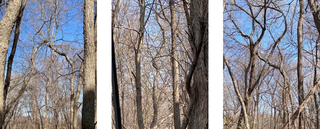
The header photo shows the tangle at its worst or most glorious. They are the end of the woods where they point out into a small field of corn or soybeans, a la Ben. Those trees are not shaped that way by the wind, in fact they are bent right into the prevailing wind. I assume their need for sunlight made them arch out and away from the tall trees. It is a favorite place for deer to bed down. But even they struggle to navigate through my woods. There are several tall trees reaching their full maturity, about which there is a mystery I will not delve into. But when the leaves are gone (I took these pictures in April.) you can see the tangle of fallen and rotting trees down the sides of the raven, which gets deep very quickly, or up among the standing trees. Or you can see my corkscrew trees, as I call them, species unknown to me. They reach up like a middle finger in the face of Capability.
Trees are in all stages of life and decay.
Many visitors live or walk through the woods or the apartment building’s strip of grass.
Just three days ago I realized that at the base of one of the mystery trees a pair of squirrels have raised almost to maturity a litter of, I think, five kits. I caught them venturing out to explore, but only on their tree so far, and took this photo through the window above my computer.
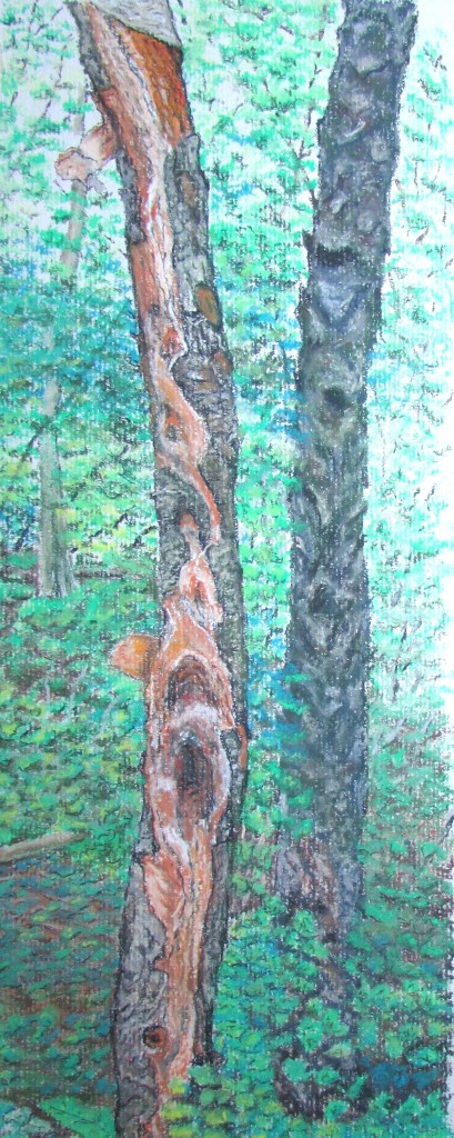
I have sketched several parts of my woods. These two trees now are mush on the ground.
This spring a thick branch on one of the mystery trees broke in the high winds and got caught as a squirrel beltway. The next day the squirrels tested carefully before venturing out on this wonderful shortcut across an open space in the upper trees. Now it is their jousting ground and a trysting place, observation deck, escape route and attack route.
I could show and tell more, but I have overstayed my welcome.
Thoreau said he had traveled much in Concord. In what small area have you traveled much?
YA took a long weekend trip to Chicago the past three days. I dropped her off early on Friday at the airport. I was really looking forward to having a long weekend all to myself. You all know that I adore YA but since I haven’t traveled for work since March of 2020, we haven’t really had a break from each other for quite a while now.
She didn’t ask me for any input on her trip, except for two questions, one about her Real ID and one about security at the airport. When I asked her if she needed a packing list printed out (I have it on my pc), she said no. (I did see that she had created and printed out her own packing list when I took a couple of things into her room yesterday!) As the parent of a young adult, I was not expecting to hear from much if at all until her pick-up (noon today).
It was a nice surprise on Friday afternoon when I got a photo text of A Sunday Afternoon on the Island of La Grande Jatte by George Seurat with a question about whether this was my favorite painting (I had mentioned my favorite painting was hanging in the Chicago Art Institute – this isn’t it).
Later on Friday I got a quick text about an “ok impossible burger” but no photo to enshrine the meal.
Then on Saturday morning this photo came.
I didn’t realize right away that it was taxidermy – The Natural History Museum. A bit later, a photo of Sue, the famous tyrannosaurus rex, showed up (header photo). No texts about dinner.
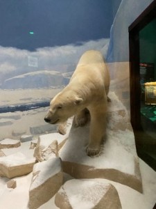
Yesterday, there was a photo of a breakfast taco and smoothie and then, some real polar bears at the Chicago Zoo
This was followed by a picture of a lovely flower – the Botanical Gardens. I didn’t even remember that this was on her schedule.
No photo of the pizza dinner last night. Her flight arrives at noon today so no more photos will be coming. But I definitely feel like I had a trip to Chicago even though I barely left the house over the weekend!
If you could get a virtual tour of someplace, where would that be?
I was a rep for a stamping company for many years…. you know, one of the home party companies. Of course, for most of my tenure, I only did workshops in my home for my dedicated following. I wasn’t really into “growing my business”; I just wanted have fun with my stamping friends and get the company discount.
I have stamps and accessories from many companies but even though I’m not selling any longer, I still get excited when the annual catalog comes out. The first day to order is today. One of the things I’ve learned over the years is that the colors of ink/paper in the catalog aren’t always QUITE the same in person as they are in the book. You wouldn’t think I would be too fussy about my ink colors (especially if you could see how many I already have). But when you have a lot, you don’t want duplication. If I’m going to get another pink pad or green pad, it needs to be a different shade. When I saw new colors called Polished Pink and Parakeet Party, I visited my rep (I signed up with her the day I resigned as a sales person) to see those colors in person.
Parakeet Party is a light but vibrant green but it occurs to me that the average person wouldn’t figure that out immediately. And it made me think about some of the incredible names that stamp companies come up with for their colors. Here are just a few… can you figure out what color they are by the name:
Coastal Cabana
Cadette
Alchemy
Mermaid
Of course a lot of them are more obvious: Rich Razzleberry, Early Espresso, Bubblegum (just about ever company that does ink pads has one named this) and one of my favorites – Not Quite Navy. I’m thinking that when they have meetings to talk about ink names, there must be alcohol involved!
What’s your favorite Crayola box? 8-pack? 24-pack? 64? Living large with the Ultimate 152? What about neons? Or glitters? Or confettis?
It was what we call “spitting” snow today, and while getting back in my car after errands, I noticed a flake that had landed on my black pant leg as I got behind the wheel. I looked closely, and actually heard myself shout “WOW!”, because this snowflake looked so different. This was not a flake of the lacy or feathery kind, that we try to imitate with scissors and white paper folded multiple times. It looked more like a tiny plastic “confetti” piece – like a flower I would have drawn as a child – with 6 identical and evenly spaced “petals” around some imaginary center.
It seemed thicker than the usual flakes, but smaller in diameter – 1/16 of an inch at most; these flakes took longer to melt than the usual ones. I caught a couple more to make sure they really were snow – yep, just like the first one.
The snow let up, and the next time I noticed it coming down, I put on a black sweater and went outside to check. But the flakes were of the standard variety – the “magic” ones were gone. I wonder if anyone else noticed them.
When have you seen something really unique in nature? What does it take to get you to slow down and look closely at something in your path?
At this time of year when you wake up to ice and snow, you have to work hard to find the fun in it. I’ve been very crabby the last week (due to work) and boy, did the crummy weather not help. All morning I was kind of fuming about it.
YA goes into the office on Wednesdays (although starting next week, we both have to go in on Tuesday/Wednesday/Thursday). When she drives, she turns her car around near the garage so that she goes headfirst down the driveway. When I went out over lunch to do a couple of errands, the tracks that her car made in the ice were kind of pretty, like the work of a modern artist working in an unusual lmedium. It was just the lift that my spirits needed.
Have you seen anything that struck you as “artsy” recently?
I’m reading a quaint little memoir called “Sunwise Turn: A Human Comedy of Bookselling”. Two women, with no bookselling experience decide to open a bookstore in New York in 1916. The book was written in 1925. It’s a fascinating story of how they got started and how they survived. The book downplays the fame of the store, but online you can easily find a history of the store which was also a salon for up and coming writers as well as an exhibition and performance space.
Early on in the book, the author describes how they came to name their shop:
The name was one of the crises through which we had somehow to get. There is sin and virtue in a name. We wanted a name that would mean something. Everything was to be significant. All kinds of titles of the thumb-mail variety were offered. My partner telephoned me one day that Amy Murray had drawn up in the net of her Gallic wisdom the name ‘The Sunwise Turn”.
They do everything daesal (sunwise) here” – Father Allen had told her of the people of Eriskay – “for they believe that to follow the course of the sun is propitious. The sunwise turn is the lucky one.”
The key goes sunwise; the screw goes sunwise; the clock goes sunwise. Cards are dealt with the sun. The Gael handed the loving cup around the banqueting table sunwise; he handed the wedding ring and loaned money sunwise An old sea captain who once came into the shop told me that wind and weather go sunwise, and once when I called in our Swedish contractor, Behrens, to confer with him about the furnace, eh said: “It out to be in the other corner of the house, maam. I always put my furnaces in the north end. Heat goes with the sun.”
I’m pretty sure naming your bookstore “Sunwise Turn” breaks every rule you can find about picking a name for your business. It doesn’t say anything about what the shop sells and it’s unbelievable obscure, but I really fell in love with the name and the thought and meaning behind it. Makes me want to open up a shop of some kind, just to use the name again.
Let’s say you are opening a shop of your own next week. What would you sell? And what would you name it?
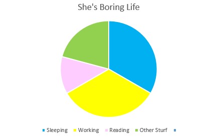
I’ve been writing a lot of notes these days and it’s been hard. I don’t find I have much to say about my life. It’s kinda boring. I work, I sleep, I read – the triumvirate. Then there’s all the day-to-day stuff that makes life run (cooking, eating, laundry, errands).
There is crafting of course. It goes into the “Other Stuff” category because it’s not a daily activity; I tend to do most of my crafting on the weekend, when the big a** work monitor is moved off my desk in my studio. It probably accounts for 6-7 hours a week.
But even with the crafting, my life right now feels boring to me. I lost my winter attitude way too soon this year and I’ve been feeling trapped in the house by the cold weather. This is not something I usually experience during Minnesota winter. The only difference between this winter and other winters has to be the lack of seeing other folks. Calls, text, even online meetings for work aren’t quite the same as being with people (although I will admit the irony that I wish I could keep working from home starting the first week of April).
I am really looking forward go warmer weather so I can add a socializing slice to my pie. And then there will soon be a gardening/yardwork slice to my pie as well as a dog-walking slice. Can’t WAIT for a more interesting pie!
What does your pie include these days? Any new slices coming up for you?
You probably all know that I’m a bit of a grouch where movies based on books are concerned. And for some reason especially where Agatha Christie is concerned (I’m not really sure why). The Albert Finney Murder on the Orient Express is good, very close to the book. The Kenneth Branagh version – meh.
But my favorite AG movies are the Peter Ustinov Death on the Nile as well as the David Suchet version from the PBS Poirot series. The PU leaves out the secondary plot but the DS messes with the characters’ motives. But I love them both and we won’t discuss how many times I’ve seen them (great background for while I’m in my studio).
I’ve known for many months that Kenneth Branagh’s Death on the Nile was looming and the trailers that I found online were a bit alarming but nonetheless YA and I ventured out last weekend to see it. Maybe I would be pleasantly surprised; after all it’s a fabulous story, how could you mess it up?
As YA and I drove to the theatre I promised her that I would not talk during the movie as I know she hates that. Then she said “and if you don’t like it, no big sighs”. Guess she’s been to that rodeo before! We bought our snacks and settled down in our seats.
I knew in the first 5 seconds that we were in trouble. It won’t be a spoiler alert to say that Agatha Christie NEVER gave Hercule Poirot a backstory. And a jazz nightclub in Paris? Nope. And I can’t even talk about how far off script the various characters were. I suppose there is something to be said about bringing a fresh coat of paint to something, but Branagh completely disassembled the furniture before adding paint. And I’m pretty sure that no tourist boat in Egypt in the 30s was staffed with scores of young, white women in shorts.
I will say that the visuals were stunning. And I will give the movie makers their due on Abu Simbel. They show the temple right at the water’s edge, which is the original location. (The temple was moved to higher ground in the mid-60s.) The PU version didn’t get this right and the DS version didn’t even have an Abu Simbel scene.
It was SO hard not to sigh and then it turns out that I could have. As we left the theatre, YA said “who was the murderer”; she had fallen asleep. When we figured out how far back she had fallen asleep, I could have sighed for at least 20 minutes!
Any remakes that make you shudder or that you like better than the original?


